Two quick tips for creating effects with Lightroom's Colour Settings
Creating a Faux Polariser Effect
Here’s a quick tip for beginning Lightroom users. If you’ve ever shot an image featuring a lot of sky and afterward wish that you had used a polariser, then you’re in luck because it’s actually relatively simple to achieve in Lightroom. Obviously you won’t be able to get the full effect of a polarising filter, especially the ability to cut reflections, but you can easily darken and enhance the sky.
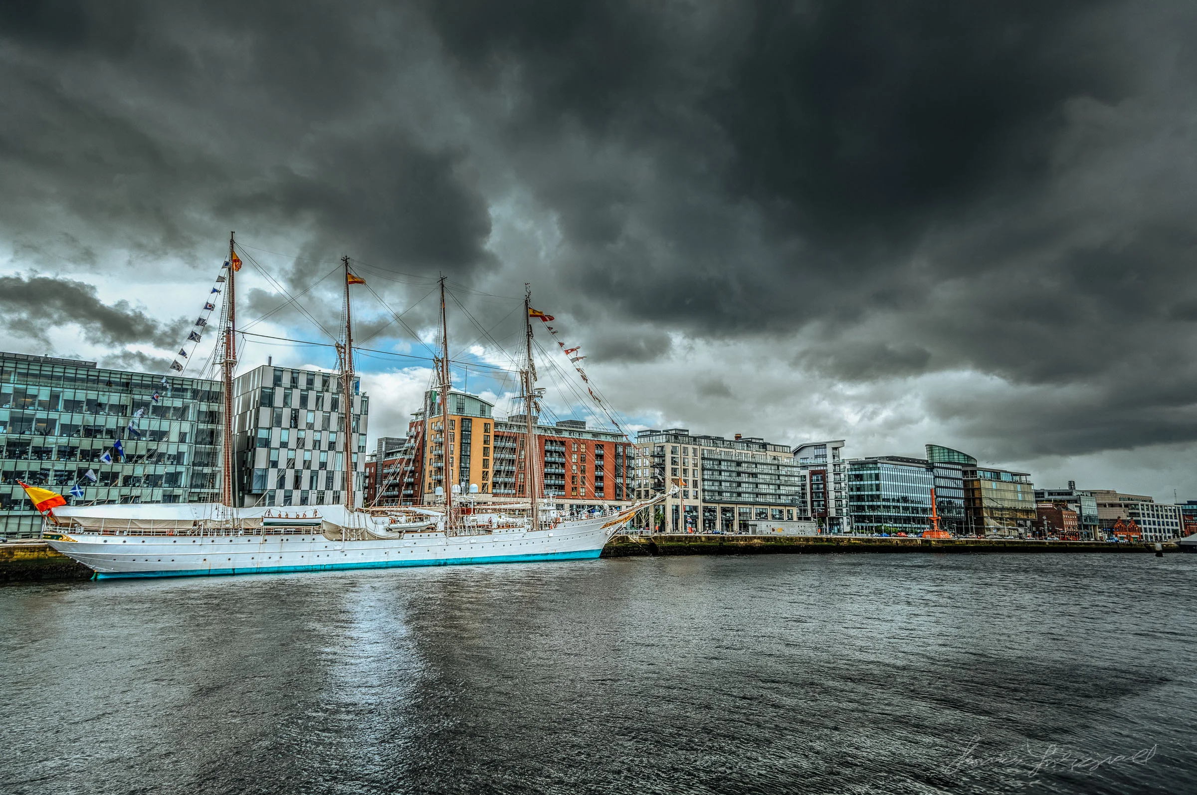
All you need to do is make some quick adjustments to the Color tab in the develop module. Here’s an example image before any manipulation.
To create a polarising effect, just do the following:
- Go to the HSL / Color / B & W tab in the Lightroom Develop module and click on "Color"
- In the Blue section, drag the Saturation slider up and the Luminance slider down. How far you need to do this depends on your image, but you generally don't need to go too far.
- You may need to do the same for the Aqua section, but to a lesser extent. You only need to do it a small amount for these colours, and only if they are in the image.
- If there are some Aqua tones that you think should be bluer then you can just drag the hue slider to the right a little.
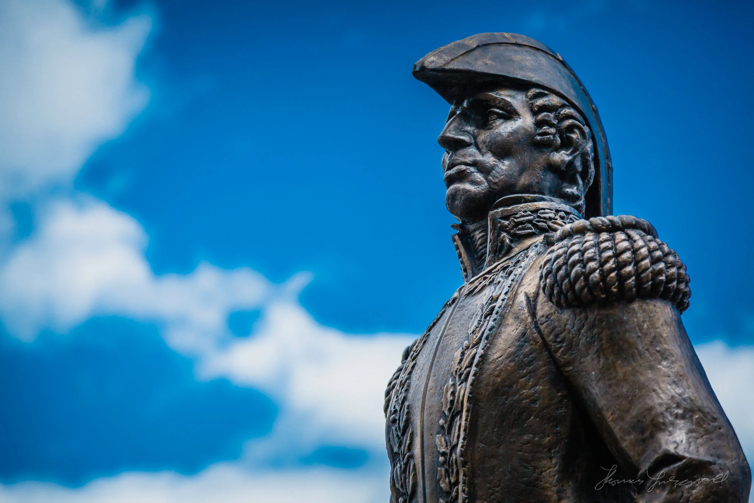
That’s it. Simple but effective. Here’s the finished image from the example above.
Here's the same image with the blues pushed even further and some additional manipulation:
In this case I did manipulate the Aqua range a little because there was some green tints on the window that I wanted to be part of the polarising effect.
Creating a “Leave Colour” Effect
The “Leave Colour” effect is a popular (I’m sure some would say that it’s a clichéd effect) black and white effect where a photograph is made into a black and white image, but one colour is left, usually red. There many are ways to achieve this in post production, from manipulating the image in Photoshop, to the dedicated function in Silver Efex Pro. It’s actually pretty easy to achieve in Lightroom using the Colour tab once again.
Here’s an image that we’re going to use as an example:
- Start by doing whatever else you need to do to your image, such as adjusting contrast etc. Do not convert it to black and white.
- So it’s easy to go back to this step if you need to start again, consider taking a snapshot. If you haven’t used Lightroom’s snapshot feature before, it’s located under the presets on the left hand side of the develop module. Click the + button beside “Snapshots” to save the current history state as a Snapshot.
- Go to the HSL / Color / B & W tab in the Lightroom Develop module and click on “Color” if the Color section is not already selected.
- In this example we’re going to be using red as our “Leave Colour”
- Drag the saturation sliders for every colour except red to zero.
- Use the red colour controls to manipulate the red colours to your liking.
- If there is some additional red in the image, other than the subject you wish to leave coloured, use a selective adjustment brush with the saturation set to zero to paint out the unwanted colour sections. Because of the way that Lightroom’s selective adjustments work, you may need to paint over it twice, as sometimes one go will not fully desaturate an area.
And that’s about it. Here’s the result:
You can add back in other colours too if you want. In the example above there is a yellow stripe down the centre of the fire engine, so I added back some yellow into the image for that. Here’s the finished shot:
A Note about "Colour" and "Color"
You may have noticed that I used two different spellings of "Colour" in this post, and are probably thinking it's a terrible mistake. Here in Ireland we use the english spelling of the word Colour with a "u" however, the Lightroom interface, even locally uses the Americanised spelling of "Color". It's standard practice to refer to onscreen elements exactly as they appear, and that's why I've used "colour" when referring to specific Lightroom elements.
Please Help Support This Site
I am a fine art Photographer and do not shoot commercially. If you like what you read here and want to help support the site, then please consider buying a Print, or checking out my Lightroom Presets